(Japanese translation by Masayoshi Nakamura.)
Many newcomers to Extreme Programming wonder what a team room looks like. (For those unfamiliar with Extreme Programming, at the end of the article you will find a quick explanation of the XP terms that I use.) Here are photos and a description of a team room from a 9-month, 5-person project. Areas in the photos that might identify the client have been blurred out. If you have further questions or would like help adopting agile methods at your own organization, please contact the author.
Overview
Here's an overview of our basic team room with the main components marked. The natural light, wood desks, and high ceilings made for a pleasant working environment. As you can see, most of the easily accessible wall space is covered with information about the project.
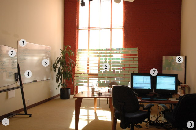
- Customer — Just out of frame to the left sat the product manager, aka the XP customer.
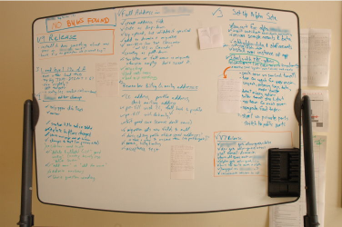
- Current stories — This week's stories were listed here with a detailed breakdown and notes.
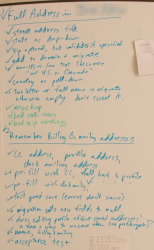
- Techie to-dos — Open technical issues.
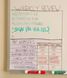
- End-of-iteration meeting agenda — Including metrics.
- General-purpose whiteboard space — Erased regularly.
- Main story card board — Included cards recently completed, upcoming, and unscheduled.
- Developer workstations — Two dual-headed stations, facing each other.
- Old story card board — Cards completed more than a few months ago.
- Continuous integration server — Just out of frame to the right; played sounds on success and failure.
1. The customer
The product manager sat at a small desk slightly separate from the developers but facing them and within easy discussion distance. To get his attention it was often sufficient just to look at him steadily for five or ten seconds, and a wave always worked. Making communication this easy meant much less guesswork on the part of developers.
2. Current stories
This board helped us to communicate about the week's status. As we planned an iteration, a story was broken down in detail. Some of the items were actual tasks, but generally we tried to break down things in story terms. As we completed each item, we checked it off. Once the product manager had reviewed the story, the story itself was checked off. The paper notes generally contain text written by the product manager, including labels and error messages.
The small box in the top left corner contains the bug tracker. When a bug (by which we meant a development flaw from a story completed in a previous week, whether or not we had actually released it) was found, we wrote it in the box. We never had two known bugs at once, and bugs were fixed the same day they were found. The tracker almost always said, as it does now, "NO BUGS FOUND".
The areas outlined in orange were where we tracked the release notes, the manual steps required for an upcoming release. Because we upgraded all the instances of the app at the same time, and because we tried to automate repetitive upgrade steps, this was generally erased and done anew for each release. The release process was never fully automated, but we improved things every release.
3. Techie to-dos
There was some ongoing work that meant nothing to the product manager. This included things needing cleanup, refactorings both proposed and ongoing, and design issues that we hadn't yet found a solution for. So that they weren't lost, we reserved an area of our main whiteboard for developer to-dos unrelated to the current set of stories. We would often pull something from here when we couldn't or didn't want to work on a story.
4. End-of-iteration meeting agenda and metrics
Every Friday after lunch, we'd have a meeting to mark the last iteration completed and to launch the new one. The permanent items on the agenda were the retrospective for the week, doing the iteration plan for next week, and the product manager looking forward to upcoming cards and business activity. We'd also add items here that occurred to us throughout the week.
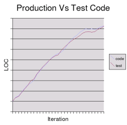
At the bottom were metrics that we were interested in tracking. We never placed too much emphasis on the metrics; we never wanted people doing something specifically because it raised the number of unit tests or lines of code. Interestingly, although we never tried to make this happen, the amount of production code was always about the same as the amount of test code.
Two of the metrics were added to highlight particular problems. At one point we fell behind in writing acceptance tests. Although we felt the right solution was to get an assistant for the product manager, we temporarily had the developers take on that work with careful review from the product manager. To monitor the gap, we kept count of the number of points of completed story that didn't have acceptance tests.
The other metric was added when the developers felt that there wasn't enough activity on the beta site. Although the metric label is blurred out to avoid identifying the client, you can think of it as the amount of content generated by users, akin to the number of posts in a bulletin board system.
5. General-purpose whiteboard space
When analyzing or designing something, we would often make use of the whiteboard. We felt that this was barely enough whiteboard space, and would have added more if the project had gone on longer.
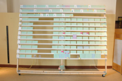
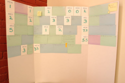
6. Main story card board
This board was the center of our product planning discussions.
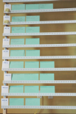
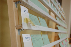
The board is divided into three regions. The top three rows contain recently completed stories, with a white half-card containing iteration date and completed point total. Below that on the left are the scheduled stories, with one row for each of the 9 weeks to come. To the right are unscheduled stories more or less in business value order. At the very bottom of the unscheduled stories is the pit of nice ideas. Below the rails is a supplies envelope containing blank cards, extra flags and post-it notes, and pencils.
Over time, we evolved a number of conventions for marking cards:
- green cards were features for end users
- blue cards were features for staff use
- purple cards were spikes
- orange flags marked cards with incomplete acceptance tests
- red flags marked cards that the team couldn't estimate without more information from the business side
- red post-it notes contained questions for the business side
- yellow tags pointed out important milestones, including releases
Having a big, central board like this was wonderful; whenever someone was thinking about the schedule, they'd walk over to the board. The movement of cards almost always triggered valuable conversations.
construction
James Home, the product manager, designed and built our board from standard hardware, available at any Home Depot. (It was loosely based on a much less impressive previous effort by William Pietri.) The horizontal rails are 1/2" x 1" wood with plastic drywall corner bead around it; the cards rest snugly in the gap between the wood and the plastic. It is held together with bolts and wing nuts for easy disassembly, and wheels make it easy to move around the office. Although James felt that building one was enough, William Pietri knows a carpenter who is interested in building them to order; you can contact him to find out more.
7. Developer Workstations
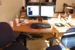
Each developer workstation had two 1280x1024 monitors, one keyboard, and one mouse. The right screen was devoted to the code editor, with everything else (browser, JUnit GUI, file browser, class browser shell window) on the left. We used IntelliJ IDEA and the usual Java tools, including Ant and Tomcat, all running under Linux. Each workstation was well stocked with pens, pencils, and blank index cards.
8. Old story card board
To make room on the main board, the oldest completed story cards were moved to this board. This allowed us to keep them around and visible while still keeping the focus on the recent past and the near future.
9. Continuous integration server
We used CruiseControl running on a semi-dedicated box for continuous integration. Every time we checked into CVS, CruiseControl detected the change and kicked off an automated build. If the build succeeded, all our unit tests and acceptance tests would be run. If everything passed, the server would play a happy sound and if something failed, we'd hear a sad sound.
Glossary
For those unfamiliar with XP, here's a quick explanation of the XP jargon that I use. For more information, there are many good sites, and I, as a consultant on adoption of agile methods like XP, am glad to take your questions as well.
- The team room, also known as a project room or a war room, is space set aside for the exclusive use of the project. Except for the occasional meeting, we spent all of our working time in this room. You can see other team rooms at William Wake's site.
- A story is the basic unit of work, roughly equivalent to the term "feature".
- Each iteration, which on our team was a week, a set of stories are selected, started, and completed.
- The stories are selected by what XP calls the customer and which we called the product manager.
- Each story's complexity is estimated as 1, 2, or 3 points;
- the sum of points completed in a week is the team's velocity.
- On occasion we don't know enough to estimate a story, so we first do a scheduled research period known as a spike.
- We also followed the XP practice of pair programming, which is why you'll see only two desks for the four programmers.
Credits
James Home acted as XP Customer and UI designer; he also designed and built our excellent card rack and took these photos. William Pietri started the team, coached them in XP, and wrote this document. The developers, Jim Kingdon, Justin Sampson, and Brian Slesinsky, all did excellent work and made significant contributions to our process.
All text and images copyright 2004 William Pietri and James Home.
